
Choosing paint sounds simple until the color goes on the wall and suddenly looks nothing like the sample card. A warm greige turns pink. A soft white looks icy. A beautiful gray reads flat and gloomy by dinner time. That weird little magic trick happens because lighting has a huge effect on how color is perceived.
Many interior designers and designers draw inspiration from the way lighting interacts with paint colors, using these effects to curate sophisticated and stylish interiors.
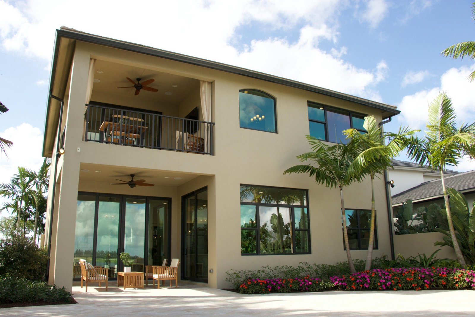
Understanding how lighting affects paint color appearance in interior design can save Jacksonville homeowners from expensive mistakes and a whole lot of second-guessing. The same paint color can shift throughout the day depending on sunlight, shade, bulb type, room direction, and even paint sheen. What looks perfect in a showroom or on a tiny paint chip can feel completely different once it is covering an actual living room wall.
At A New Leaf Painting, our color consultation services help homeowners make smarter color decisions based on the real lighting conditions inside their homes. With more than 20 years of experience across Jacksonville and Northeast Florida, our trusted Jacksonville painting company knows how coastal light, shaded lots, open floor plans, and artificial lighting all influence the final result. This guide breaks down the basics so you can choose colors with more confidence and get a finish that looks beautiful morning, noon, and night.
Why Light Changes Paint Color

Paint does not create color on its own. It reflects light. That is the whole sneaky little beast right there.
When light hits a painted surface, some wavelengths are absorbed and others bounce back to your eye. The type of light in the room changes which wavelengths are most visible, which changes the way the color appears. Artificial lights such as LED, incandescent, and fluorescent can shift paint hues based on their color temperature, which is measured in Kelvin. Natural daylight provides the most accurate color representation in interior paint. That means the exact same wall color can look warmer, cooler, brighter, duller, or more saturated depending on the lighting conditions.
This is why a paint swatch in a store often fails as a predictor of how the color will look at home. Paint stores typically use bright, even overhead lighting. Your home probably does not. It has shadows, windows, lamp light, recessed fixtures, and natural sunlight changing by the hour. Once the paint moves from the chip to the wall, reality enters the chat. The hue and tone of the paint can shift dramatically, making colors appear brighter, duller, or more saturated depending on the lighting. Additionally, the Light Reflectance Value (LRV) of a paint color measures how much light it reflects—higher LRV colors can make small or dark rooms feel larger.
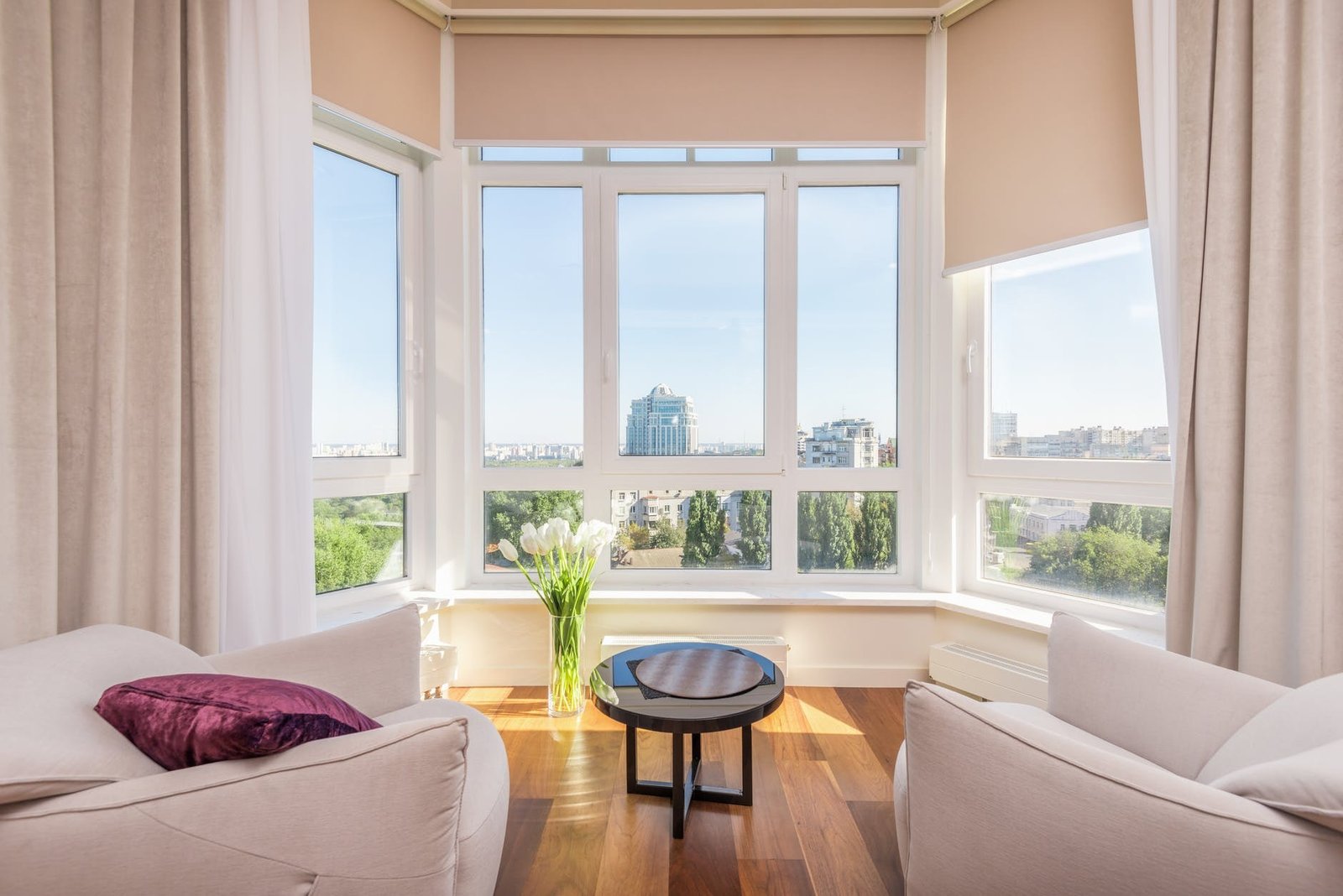
Natural Light and Room Orientation
Natural light has the biggest impact on interior paint color, and room direction matters more than most homeowners realize.
East-facing rooms receive warm morning sunlight that shifts to a cooler tone in the afternoon; using warm neutrals in these spaces helps maintain a cozy feel throughout the day.
Choosing the right base colors, such as versatile neutral shades, is essential for adapting to different lighting conditions and achieving a balanced, sophisticated look.
North-facing rooms
North-facing rooms usually get cooler, softer light. This light is indirect and has a cool, bluish tone, which makes colors appear darker and flatter. That light can make colors look more muted and can pull gray or blue undertones forward. A color that felt warm in the store may look flat or chilly in the room.
For north-facing living rooms, warmer neutrals often work better. Think soft beige, creamy white, warm greige, or gentle taupe. Choosing deep shades, such as deep greens or rich browns, can also add depth and warmth to the space, helping to counteract the cool light and create a more inviting atmosphere. These tones help balance the cooler light and keep the room from feeling dull.
South-facing rooms
South-facing rooms get the most consistent sunlight, and in Jacksonville that can be a lot of sunlight. These spaces usually make colors appear brighter and warmer, and certain paint colors can further brighten the room by enhancing the natural light. They tend to show paint more accurately, but they can also intensify strong undertones.
This is often a great place to use cooler paint colors like muted blue-green, soft sage, or crisp gray to balance the warm light. Deeper colors also tend to hold up well in south-facing rooms because they do not get swallowed by darkness.
East-facing rooms
East-facing rooms get warm light in the morning and cooler light later in the day. That means the walls may feel sunny and cheerful at breakfast, then noticeably softer and grayer by afternoon.
Colors with flexible undertones usually perform best here. Soft off-whites, balanced greiges, and muted warm neutrals adapt well to the changing light.
West-facing rooms
West-facing rooms are the opposite. They tend to feel more neutral earlier in the day, then take on rich golden light in the afternoon and evening. This can make warm paint colors feel very warm, sometimes too warm.
If a room gets intense afternoon sun, test your samples carefully. A subtle cream can turn yellow fast. A beige can start looking peachy. That is not a design failure. That is just physics being dramatic.
Artificial Lighting Changes Everything After Sunset
Once the sun goes down, your bulbs take over. And yes, they absolutely change the way paint looks, as artificial lighting creates different moods and effects in a room.
The sheen of paint also affects its light interaction—matte finishes absorb light, while glossy finishes reflect it.
Warm white bulbs
Warm white bulbs, usually in the 2700K to 3000K range, create a cozy, yellow-toned light. They tend to make reds, creams, and warm neutrals feel richer and softer. They can also mute blues and cool grays.
This kind of lighting is often flattering in living rooms, bedrooms, and dens because it feels relaxed and inviting.
Cool white bulbs
Cooler bulbs, usually in the 3500K to 5000K range, bring out blue, green, and gray undertones. These can make white paint look cleaner and crisper, but they can also make a room feel colder if the color palette is already cool.
These bulbs are common in kitchens, bathrooms, garages, and work areas, but they can make a comfortable living room feel a little clinical if not balanced well.
CRI matters too
Color temperature gets most of the attention, but CRI matters too. CRI stands for Color Rendering Index. It measures how accurately a light source shows color compared with natural light. Bulbs with a CRI of 90 or higher usually give a much truer view of your paint color.
Cheap low-CRI bulbs can make beautiful paint look muddy or off. It is like putting your walls through a bad filter and then blaming the paint.
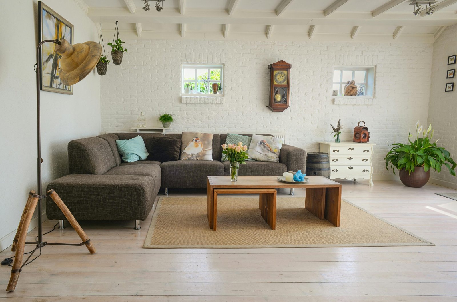
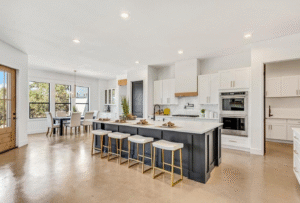
Living Room Paint Ideas Based on Lighting
If you are choosing living room colors, lighting should guide the shortlist, especially when you are comparing the most popular interior paint colors homeowners use.
When considering living room paint colors, it’s helpful to look at popular paint brands like Benjamin Moore and Sherwin Williams, which offer a wide range of popular paint colors trusted by designers. Shades like Benjamin Moore’s White Dove are especially popular as a neutral shade for a white living room, providing a timeless color that serves as a great backdrop for various decor styles. Neutral shades allow for flexibility in decorating and can be paired with more color or bold color accents to complement your overall style. Deep colors, such as deep brown neutrals like Sherwin Williams’ Anonymous, can create a cozy and intimate atmosphere in larger spaces, while warm green-gray shades like Sweater Weather are ideal for an inviting, sophisticated living room. Bright, warm whites like Dover White are effective for brightening dimly lit living rooms, and warm whites remain a timeless choice for a soft, inviting backdrop. Navy blue is a timeless color that adds a calming effect and pairs beautifully with jewel tones and gold accents for a sophisticated look. Olive green is a versatile hue that can transform a room into a tranquil oasis, while dusty blue and soft blues are favored for their modern and nostalgic qualities. Muted teals are becoming popular for their calming yet bold qualities, and plaster pinks are trending for a sophisticated and balanced look. Muddy greens are favored for their deep, grounding effect, serving as a great backdrop for artwork and decor.
For dim rooms, lighter and warmer tones usually work best. Warm whites, soft cream, pale beige, and gentle warm gray can help bounce light around and keep the space from feeling heavy. Bright whites are less favored in current trends, as warm whites create a cozier, more inviting atmosphere. Incorporating subtle texture and more texture through decor choices like pillows, throws, and natural materials such as wood and marble adds depth and sophistication to the space. Gold and gold accents can be used to elevate the decor, especially when paired with jewel tones like plum, emerald, or teal for a luxurious, bold style.
For bright sunlit rooms, you have more range. You can use richer colors without the room feeling closed in. Soft olive, dusty blue, moody green, warm clay, and even deeper gray can look fantastic when natural light keeps them alive. Deep shades and bold color choices, such as jewel tones or a statement accent wall, create contrast and bring new life and energy to the living room. Traditional materials like wood or marble can be used for accent walls or side tables, adding natural texture and a sophisticated, timeless feel.
For rooms with changing light, adaptable neutrals usually win. Shades like soft greige, warm off-white, and balanced gray-beige tend to stay more consistent across morning light, afternoon sun, and evening lamps. These neutral shades complement a variety of decor and allow you to easily introduce more color or bold accents as your style evolves. Fresh paint colors and techniques can give new life to your living room, invigorating the space and reflecting your personal style.
Why Off-Whites and Neutrals Are So Tricky
White and near-white paints are often the most deceptive colors in the house. They seem safe. They are not. They are tiny undertone delivery systems in disguise.
In recent trends, bright whites are less favored compared to warm whites. Bright whites can sometimes feel stark or clinical, while warm whites are preferred for their softer, more cozy qualities that help create inviting living spaces. A white with a yellow undertone can feel creamy and soft in one room but overly warm in another. A crisp white with a gray or blue undertone can feel modern and fresh in bright light but cold in a shaded room. Greige, taupe, and warm gray are just as sensitive.
Warm whites are a timeless choice for living rooms, providing a soft and inviting backdrop. This is why large sample testing matters so much. A small chip cannot show how undertones behave across an entire wall. Once that color spreads out and catches real light, all its little secrets come crawling out.
Paint Finish Affects Color Too
Even if you choose the perfect shade, the finish changes how the color is experienced. Different paint finishes also add texture to walls, enhancing visual interest and depth in your interior design, and broader house painting guides for Jacksonville homeowners can help you plan these details before you start.
Flat and matte finishes absorb more light, which can make color appear softer and slightly deeper. These finishes introduce a subtle texture that reduces glare and helps hide surface imperfections, making them a strong option for many living rooms with an understated, elegant look.
Eggshell and satin reflect more light, so they can make paint appear brighter and a little more vibrant. They are also easier to clean, which makes them practical for higher-traffic spaces.
Higher gloss finishes create more reflection and more visual movement. They are usually better reserved for trim, doors, and accents instead of full living room walls.
How to Test Paint Colors the Right Way
The best way to choose paint is to test it in your actual home, under your actual lighting, like a sensible scientist with a roller. Large paint samples should be at least 2′ x 2′ to accurately assess color in various lighting conditions, and partnering with professional interior painters in Jacksonville ensures those test results translate into flawless finished walls. It’s also recommended to observe paint samples over a period of 48 hours to understand how they change in different lighting.
Paint large sample areas or use sample boards that are at least 2′ x 2′. Move them around the room if possible. Look at them in the morning, midday, late afternoon, and evening. Turn on lamps. Open the blinds. Close the blinds. Stand near the wall, then look at it from the sofa and from the doorway. When testing on surfaces with more texture, such as walls with natural materials or different finishes, notice how the paint color appearance can shift and interact with the added depth and visual interest.
Pay attention to how the color works with your flooring, furniture, cabinets, and trim. A wall color never exists alone. It is always in conversation with everything around it.
Also, give yourself at least a day or two before making the call. First impressions are not always reliable. A color you love for ten minutes can start annoying you by nightfall.
Common Mistakes to Avoid
One of the biggest mistakes homeowners make is choosing color under store lighting and assuming it will translate perfectly at home. It almost never does.
Another common mistake is ignoring bulb type. If you install a beautiful neutral paint and then light the room with harsh cool bulbs, the final look may feel completely off, even when the work is done by experienced residential painting contractors. It’s also important to consider the overall style of your space when selecting paint colors, as the design approach and aesthetic should guide your choices for a cohesive result.
Testing samples that are too small is another classic trap. Tiny chips cannot show depth, undertones, or how the color will complement other elements in the room, such as furniture, flooring, or decor. And choosing paint before understanding the room’s natural light is basically decorating by coin toss.
Get Expert Help Choosing the Right Paint Color
Lighting changes everything when it comes to interior paint. It affects warmth, depth, undertones, and mood. Once you understand how lighting affects paint color appearance in interior design, it becomes much easier to choose colors that feel right in your actual space.
At A New Leaf Painting, we help Jacksonville homeowners take the guesswork out of color selection with experienced guidance, professional sampling advice, and beautiful finished results. Whether you need full interior painting, help refining your living room paint ideas, or a professional color consultation, our team is here to help.
Get started today:
Phone: 904-615-6599
Color Consultation: Schedule Your Consultation
Estimate: Request Your Free Estimate
We proudly serve Jacksonville and surrounding Northeast Florida communities with professional painting services backed by more than 20 years of experience and hundreds of verified 5-star client reviews!